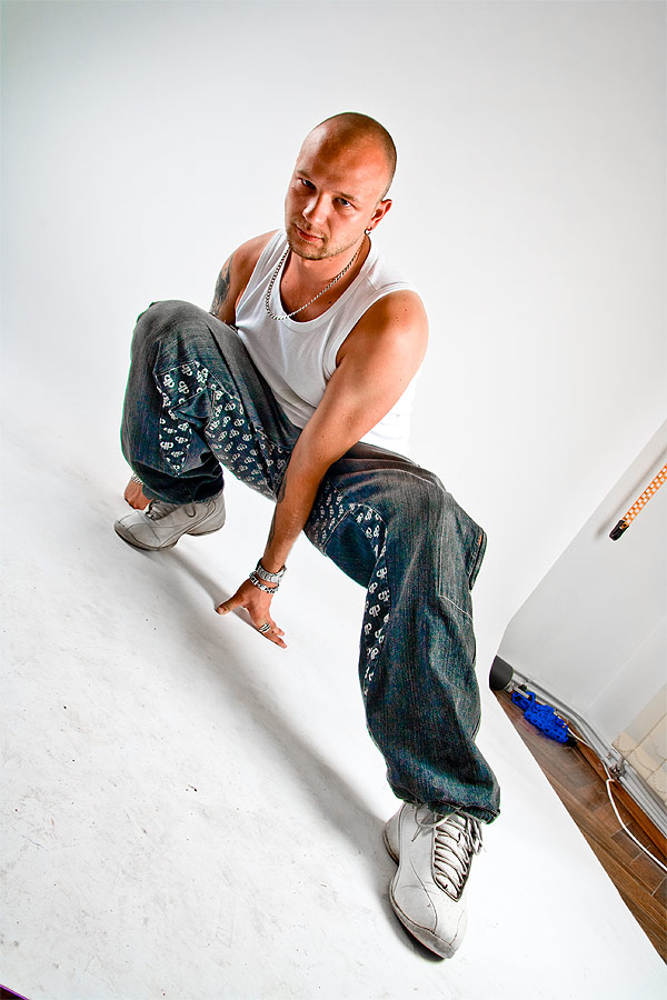
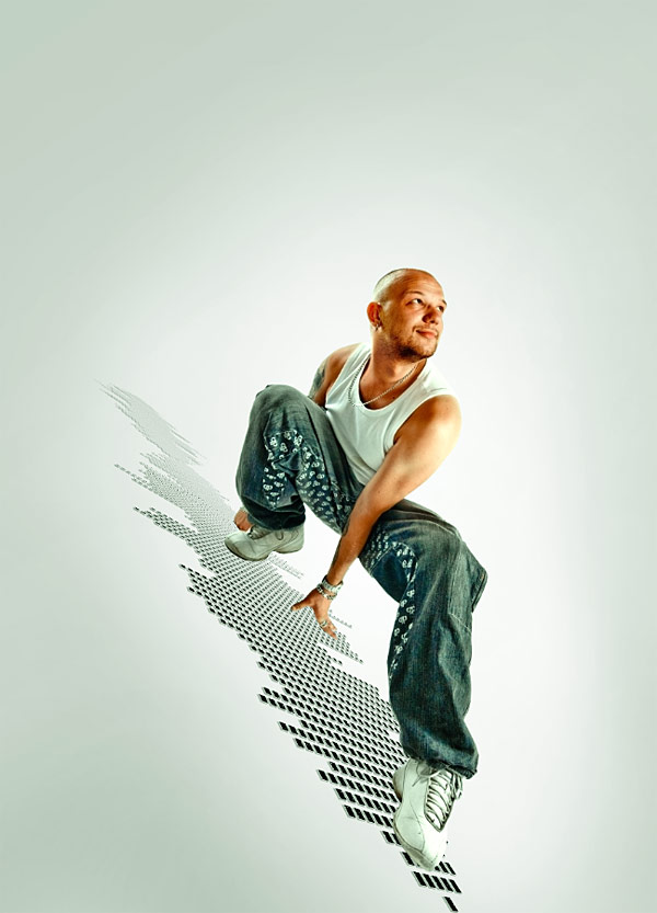
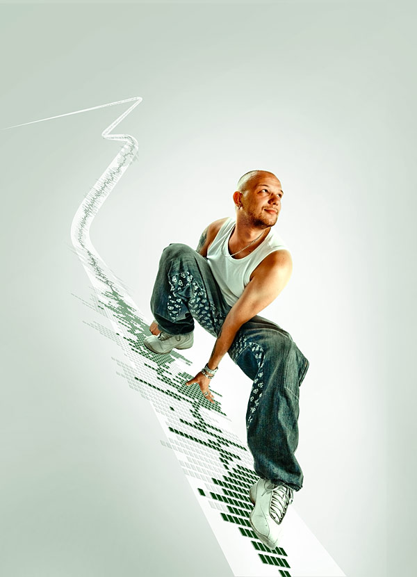
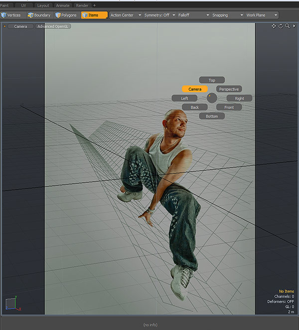
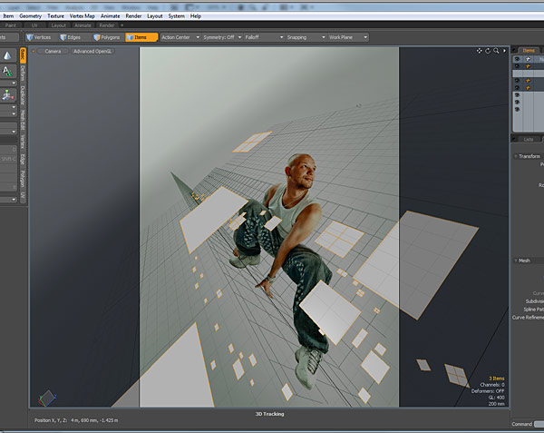
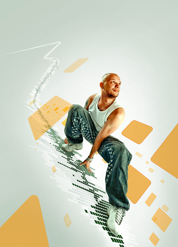
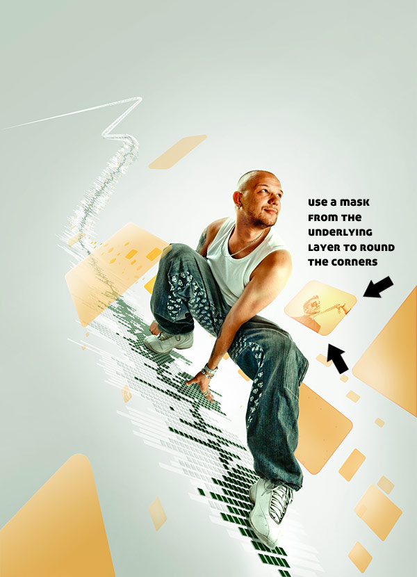
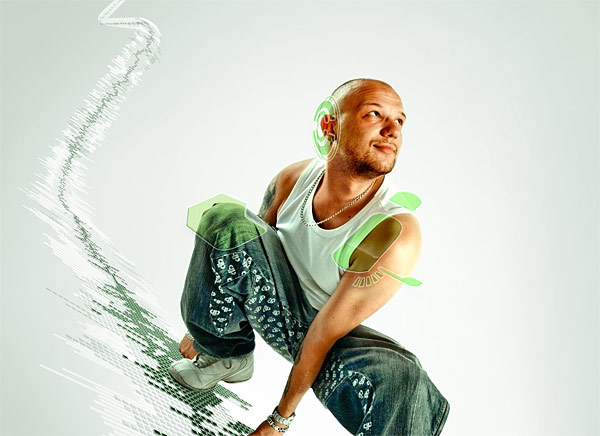
Final Image Preview
Take a look at the image we’ll be creating. Want access to the full
PSD files and downloadable copies of every tutorial, including this one?
Join
Psd Plus for just $9/month. You can view the final image preview below or view a
larger version here.
Tutorial details:
- Programs: Adobe Photoshop CS4 and Modo
- Difficulty: Advanced
- Estimated Completion Time: 5-7 h
Step 1 – Preparing the canvas
Before we begin there are a few things worth mentioning. All the photos in this tutorial belong to the author,
Pirosca Marcel. They were not gathered from stock sites around the net. The main character was shot in my photo studio.
First off I opened the original image resulted from the shooting with
the main purpose being isolating the character and the shadows on the
floor. First thing I noticed was that his face was not expressive enough
for what I had in mind.
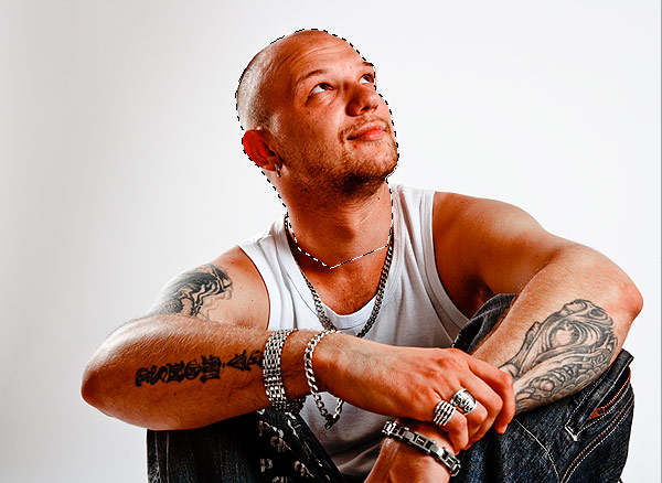
Before we begin cutting out the character I needed to replace his
head with one from another picture where he looked more optimistic. I
always shoot a lot of pictures every session, so when situations like
this arise I have plenty of other images to choose from. The most
important thing is that the light sources must be in the same place so
it integrates seamlessly and believably. The light needs to come from
the same directions. I have found the image below to be a good match for
what I needed.
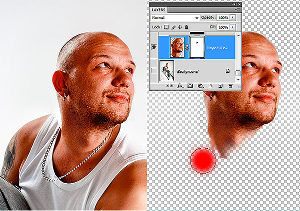
Using the Polygonal Lasso Tool create a selection around his head.
The background contains only a flat color, so the selection should be
very easy to make. I selected his head just as in the image below, then
copy/pasted it into the original image, on a new layer.
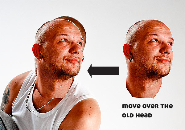
I scaled and rotated it so that it matched the old head.
As you can see some integration is needed to be done for the head to
blend perfectly. First off, cut out the background head so we can work
on our new one. Use the Polygonal Lasso Tool to select and delete it. We
should now have something similar to what we see below.
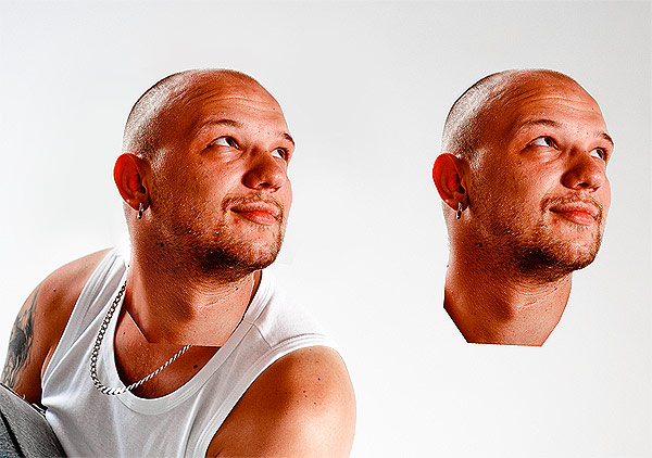
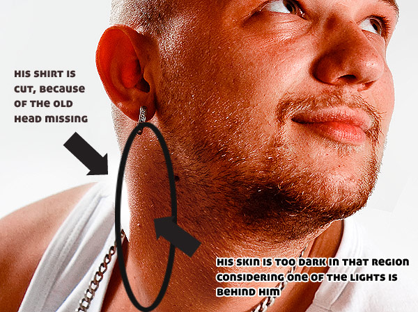
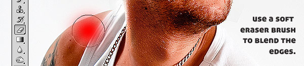
Notice that the most important region to work on is his neck. In
order to obtain a nice transition from one to the other we need a
transparency mask on the new head, then with a relatively soft (50%)
Eraser Brush start deleting some of the harsh edges on the neck until
you reach a good result. This part is open to a lot of trial and error,
so using a mask will help us recover some of the parts we may have
accidentally deleted. Finally, you should obtain something similar to
the next image.
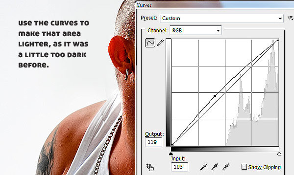
As we can see we need to work on some of the details. We need to fix
the shirt and neck lighting in order for him to be believable. For the
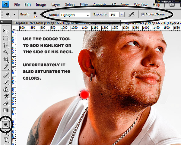
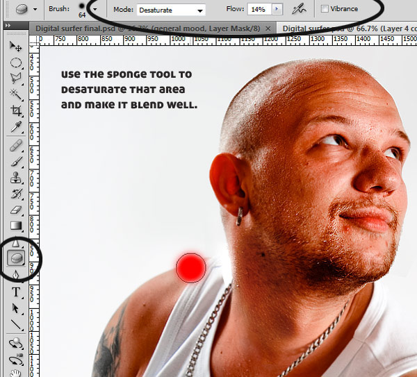
neck I used a combination of Dodge/Sponge tool as illustrated below.
In order to fix the shirt I copy/pasted a part of his shirt and then I blended it (using curves and transparency mask).
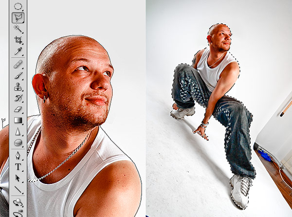
We are now ready to isolate our guy and the shadows on the floor. As
he is a hard edged surface against a flat background it should be fairly
easy to select him using the Polygonal Lasso Tool. I personally prefer
this tool over the paths approach to selection because I don’t have to
adjust any control points and tangents, even though it means a lot more
clicks. Copy/paste him into a new layer.
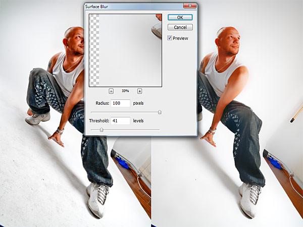
Next thing we want is having the shadow on a different layer. As you
can see the background of the photo studio was kind of dirty, so in
order to remove the stains I applied some Surface Blur. I found that
this type of blur is best for this operation as it removes noise while
preserving some detail.
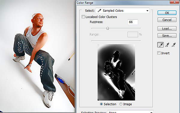
Once we got to this stage we can select the shadow using Color Range and the following settings.
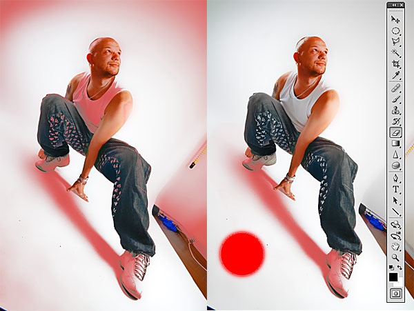
Of course there will be some unwanted regions in the selection. Hit
OK, and after the selection was made enter Quick Mask mode. Proceed to
erase the unnecessary parts, as depicted in the image below.
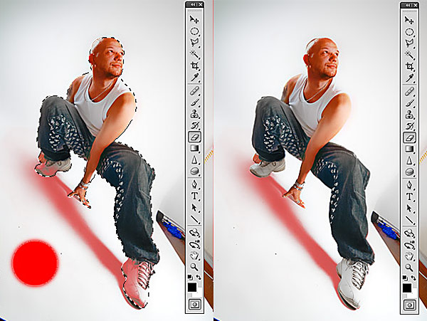
Now in order to have the exact shadow we need to subtract the contour
of our guy from the remaining selection. While in Quick Mask mode
Control-click the thumbnail of the main character layer in the layers
palette. This will load the selection for that layer. Press Delete to
erase the quick mask inside the selection.
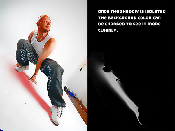
Exit Quick Mask mode and we have the selection of the shadow. Just copy/paste it onto a new layer.
We now have the character and his shadow isolated and on separate layers. We are ready to begin the final image.
Step 2 – Composition
This was a
HUGE piece of work, size related. In order to
achieve the final image we need to create an image 3613 by 5000 pixels.
To get an idea of what I actually wanted, first I took the main
character and moved it around the canvas; finally deciding to place him
on the lower half of the image following the flow of his body. Being on a
separate layer meant I could add all sorts of details behind him. The
first thing that needed to be done was to further differentiate him from
the gray background.
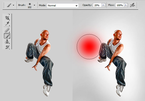
Use a white, soft brush with 20% Opacity to create a glow behind the guy.
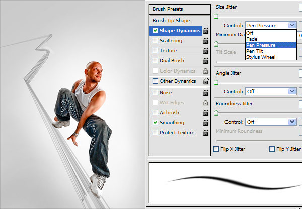
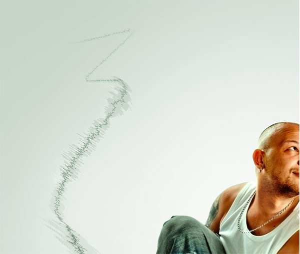
Next it’s time to determine how the lines in the image would flow.
For this I used my tablet with the size controlled by the pen pressure
and Opacity set to about 30%. I proceeded in drawing the lines on which
our man was surfing by holding Shift (so that the brush draws a straight
line) and pressing harder on the tablet (for the line to be thicker) at
his feet and then pressing less as the lines faded away.
This gave the lines the feeling of perspective and also helped me to
give a sense of depth. I have to add that this is a process prone to a
lot of trial and error, so it might take a while until you are satisfied
with the results.
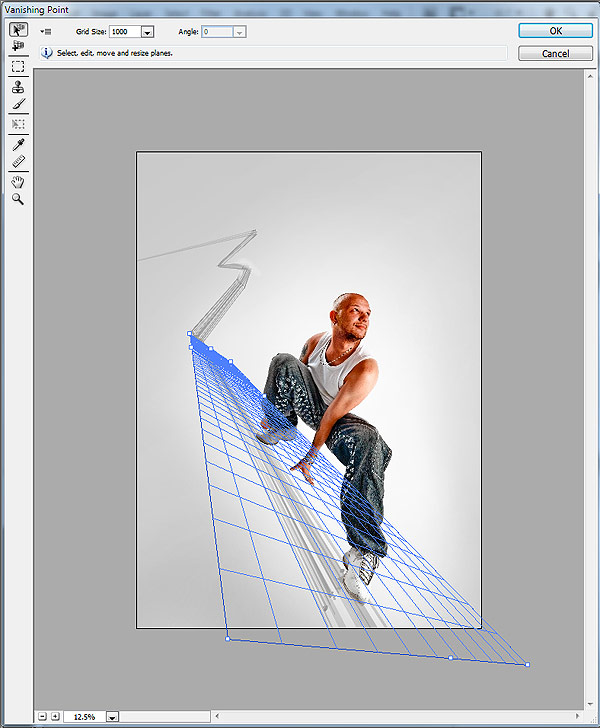
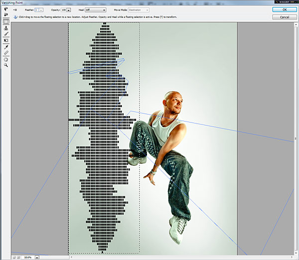
Now it gets interesting. In order to be able to replicate all of the
planes fading away and also maintain proper perspective I used the
Vanishing Point Filter to
eyeball the plane our man is surfing
on. There is an entire discussion here, because you can’t define that
plane exactly how it is in reality since you have no reference. After
several attempts I settled for the one below, thinking it works. To do
this go to Filter > Vanishing Point.
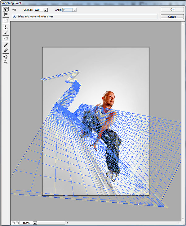
The deal with Vanishing Point is that these planes can be extended at
90 degrees or arbitrarily. Using this method I further constructed
additional planes to help me keep track of perspective, while trying to
match my sketch lines as close as I could.
With this setup in position I was now able to add elements that will
be flowing along these planes. But first I had a point to settle.
Somewhere along the line I experimented with color variations since
the gray seemed a little dull. I love color and decided to use its power
to give it a little punch.
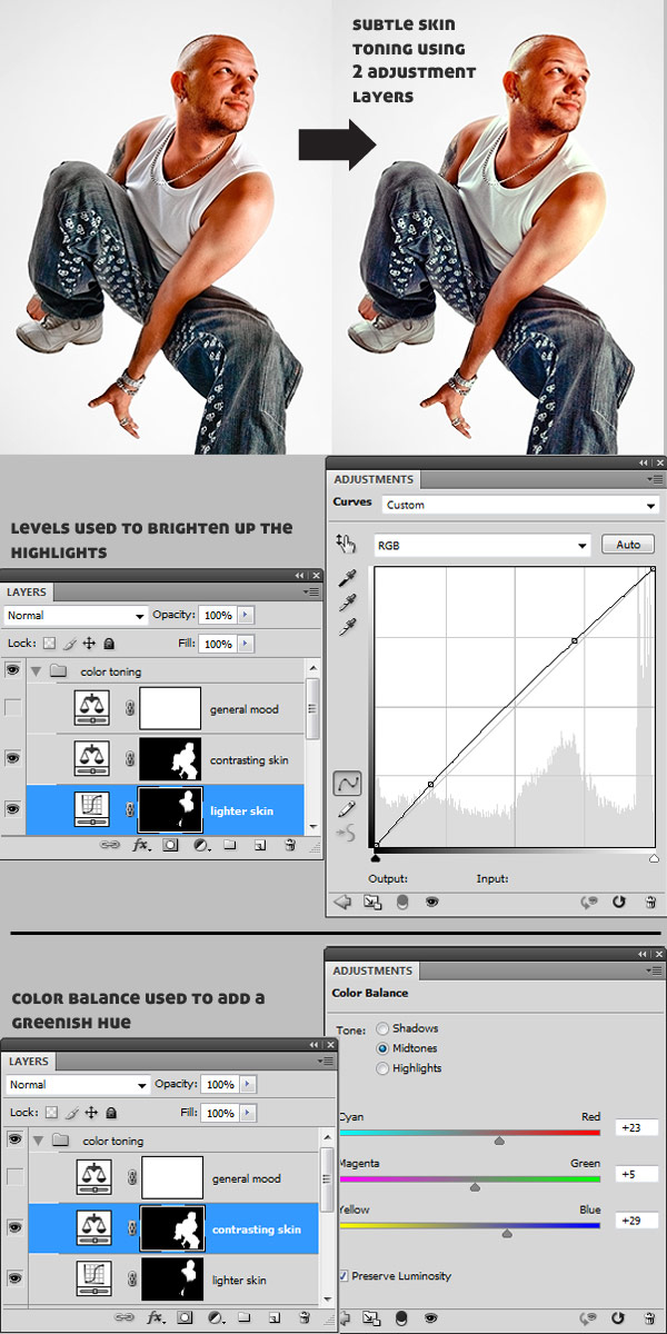
Step 3 – Color Scheme
In order to obtain the proper colors for this piece I used three
adjustment layers and placed them on top of the image. Two of them
affecting only the skin (using masks), and a third one to set the
general mood. For the skin, a Levels and a Color Balance to add subtle
color enhancement.
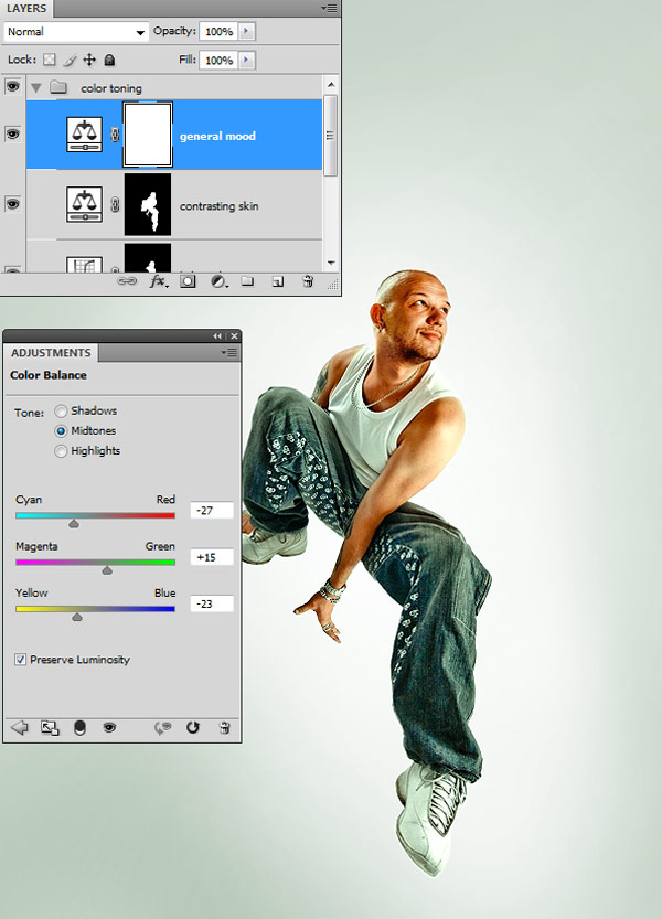
And then a Color Balance affecting the whole image to give an overall greenish mood. The settings are shown below.
We are now ready to add in the details.
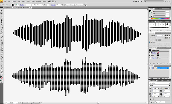
Step 4 – Digital Volume
Open Illustrator and by copy/pasting and then scaling vertical
rectangles you can obtain something similar to the first digital volume
in the image below. Make a copy and move it below.
By adding horizontal rectangles and subtracting them, it’s easy to
obtain the second one. Just create one rectangle, move it vertically (by
holding down the Alt key to create a copy) and press Command + D
repeatedly to multiply it.
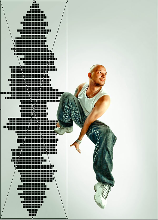
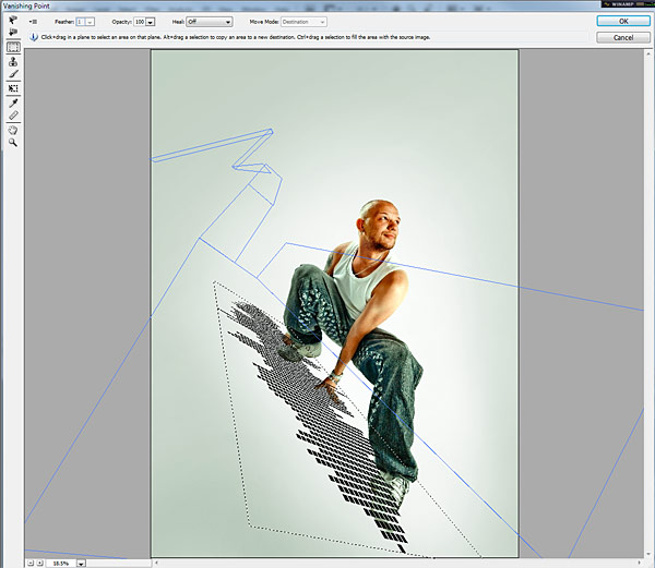
Copy the second volume graphic and go to Photoshop.
Now paste it into the Vanishing Point filter. For some reason
Photoshop doesn’t allow directly pasting paths from Illustrator there.
So we must paste it on a new layer as pixels first. Rotate it and scale
it vertically just as in the image below in order to have as much
resolution as we can.
Then Command-click the layer thumbnail in the layers palette. This
will bring up the selection of that layer. Press Command + C to copy it
into the cache, then delete the layer. We can now move to the Vanishing
Point filter.
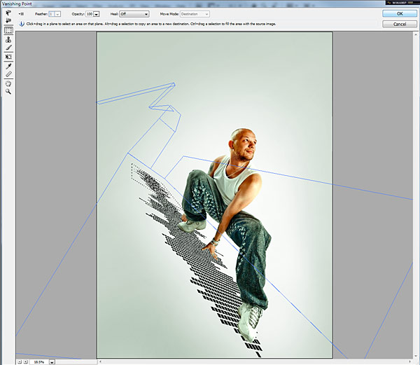
Go to Filter > Vanishing Point and paste. You should have something like that shown below.
Now if you drag that selection onto the floor plane, Photoshop will automatically calculate the right perspective for you.
Do it again to extend the volume further back.
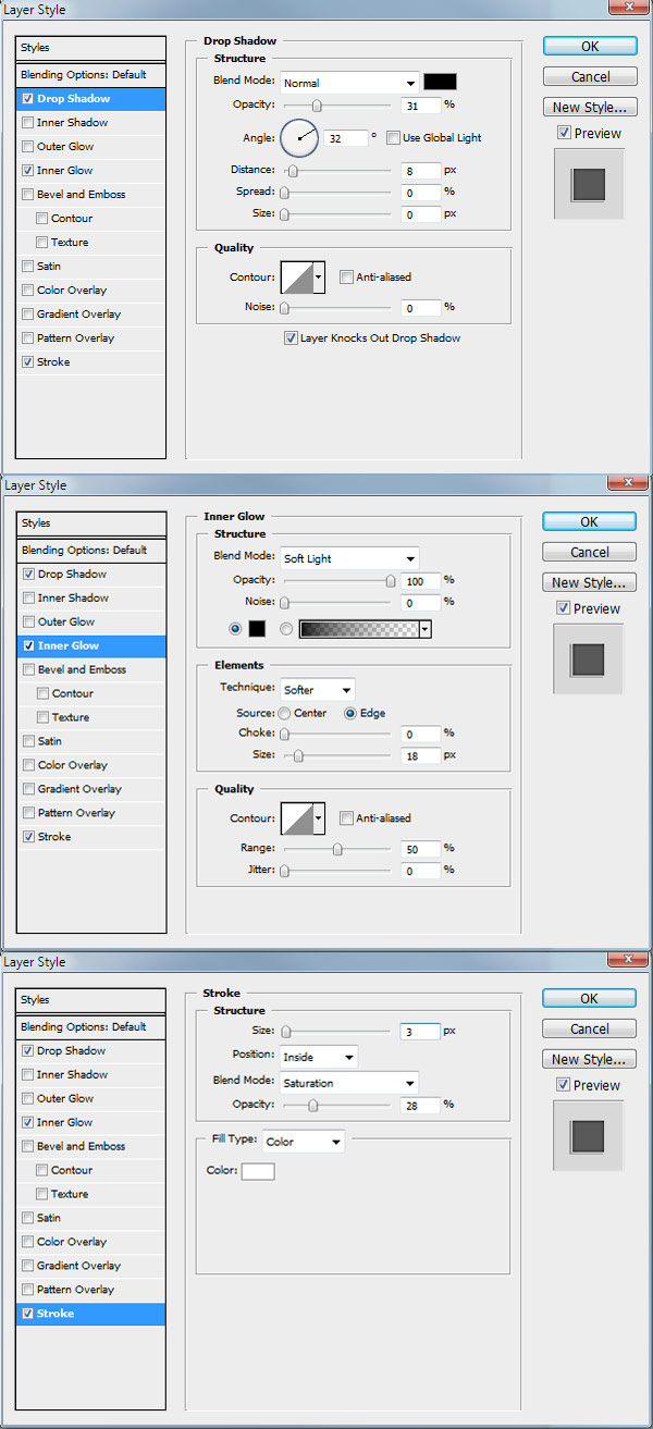
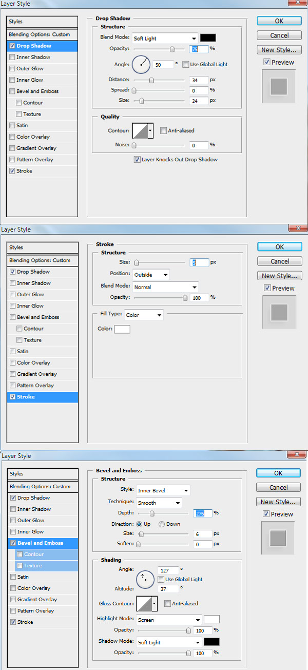
Go to blending options and add the styles shown below.
You should now have something looking like this.
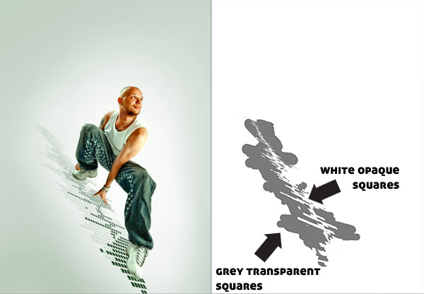
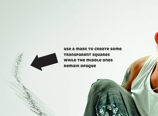
In order to to have some of the squares transparent, like in the
final image, create a Transparency Mask for this layer, and then use a
50% gray (#7a7a7a) to paint over the squares that you want transparent.
This can be a tedious process and it is up to you to decide which ones
you leave opaque and which not. I will illustrate.
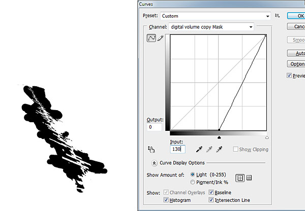
Now to give it a little punch, duplicate that layer, set its Opacity
to 68%, and apply the following Curves (Command + M) to its transparency
mask and you get this. The gray in the mask should have turned to black
so this layer affects only the opaque squares.
It should look something like this.
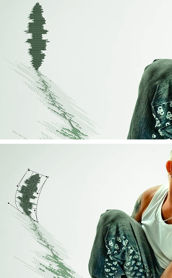
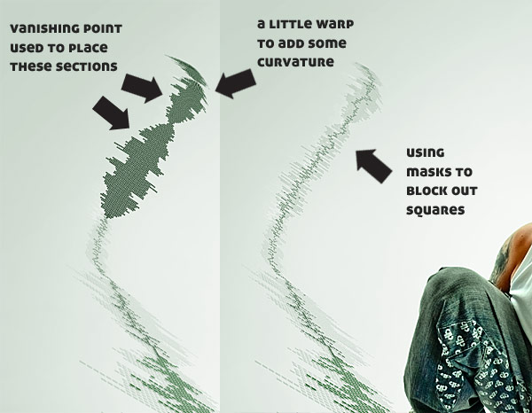
We have reached a delicate part which takes a lot of tweaking to get
right, but the main idea is to use a copy of the volume, move it into
place and then use the Warp Tool to simulate the curvature. The tricky
part is that some of the lines may get curved the wrong way and I had to
personally correct them. Fairly time consuming I must say, but no other
idea to create that corner came to mind.
Using the same technique as before, create a transparency mask and block out some transparent squares using a 50% gray.
Again, use the Vanishing Point Filter, Warp and a Transparency Mask
to create the next section. It will take some work, but I already
illustrated the necessary techniques.
We proceed to add the rest of the sections until they vanish.
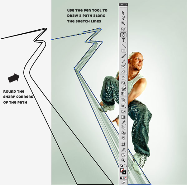
Back to Illustrator. Using the Pen Tool to create a path along the
sketch lines. Then round the corners. The easiest way for rounding
vertices is to use a script called Round Any Corner found in this
archive. Read more
here.
Fill the final path with white, remove the stroke, and copy/paste it into Photoshop underneath the “volume” layer.
In order to enhance the look I decided to add another volume, this
time white, underneath the one we created. Use the Vanishing Point
filter once again, copy the first volume created in Illustrator, and
extend it into perspective, as shown below.
As we can see, the trail is overlapping the white volume, so we need a
mask to hide part of it. Leave only the top-left section visible.
We just need to add the shadow underneath our guy and we’re done with
this section. We isolated it earlier in another document so just
copy/paste in a new layer and align it. Set it to Color Burn with 50%
Opacity. Now he looks like he’s actually there.
Step 5 – Background and Foreground Images
There are multiple ways to create the flying images, but I found that
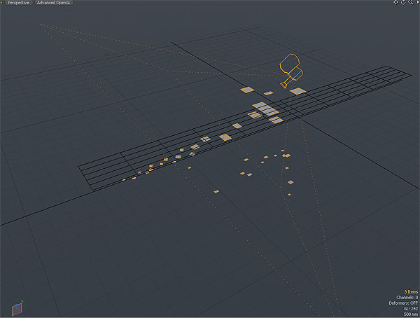
the quickest and easiest was the 3D approach. Basically, I took the
planes generated by Vanishing Point and tried to recreate them in 3D.
Considering that they were flying on a vertical plane on the surfer’s
sides meant I had to create only one plane. I could extend everything
else from there. Hang on, you’ll see what I mean.
The application of choice was
Modo,
but this can be done just as easily in others too. Again, I did this in
3D because it was much faster, I could move the planes into perspective
much easier, which means more experimenting hence better results.
Arguably I could have done this with Vanishing Point too, but it would
have been time consuming.
Besides on my computer, Photoshop kept crashing if I worked more than
30 seconds with Vanishing Point, which happened about 100 times when
doing work on the music volume. After that, I knew 3D was the only
choice. Besides you’ll learn a new technique.
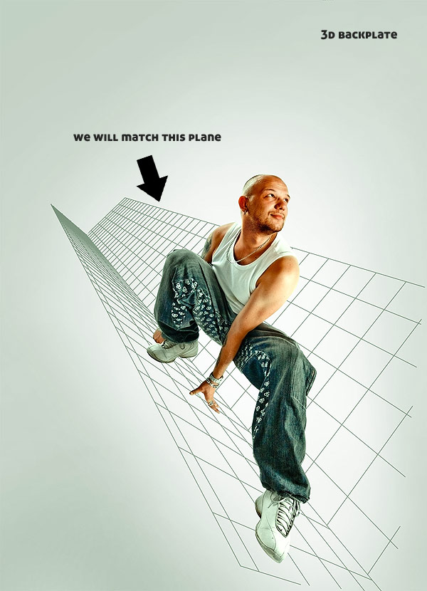
First and foremost we need to prepare a backplate for the 3D
environment with the plane we need to match. I used the following image.
Save it as a separate JPG.
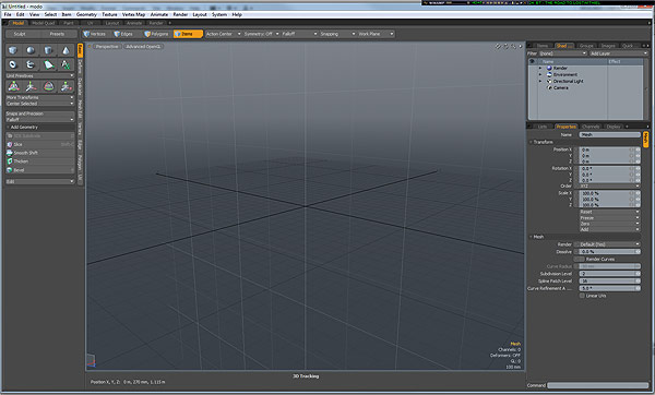
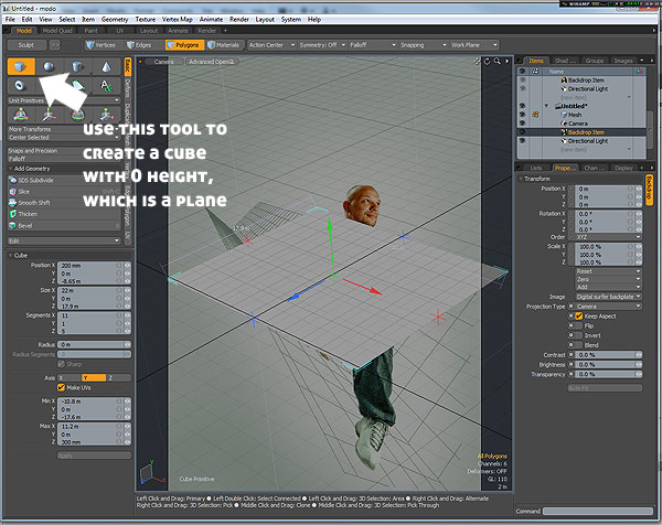
In Modo create a new scene.
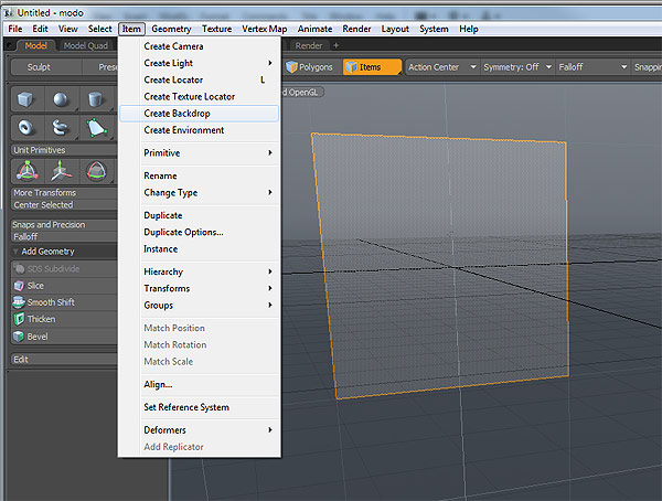
Go to Item > Create Backdrop. This creates a plane which we can add the image above as reference.
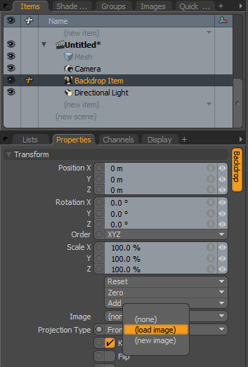
On the right you will see the following menu. From the Items list
choose the backdrop item you just created, then in Properties, go to
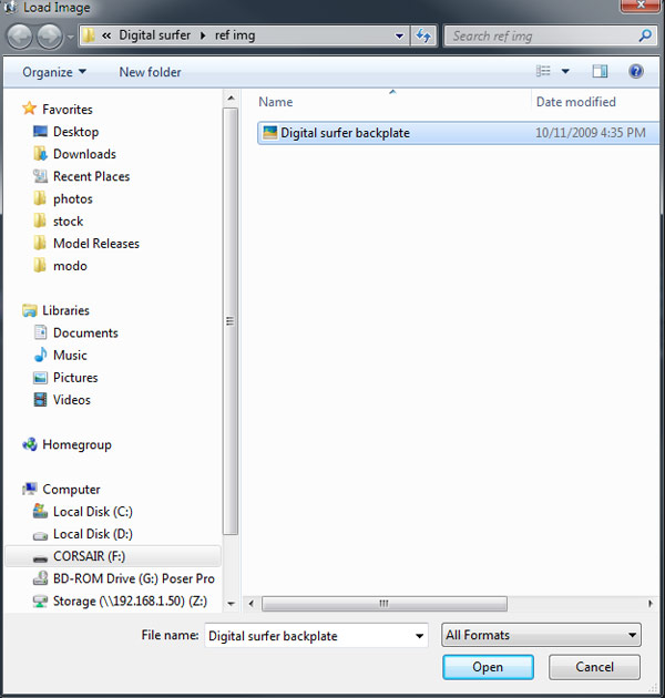
Image > Load Image.
Choose the “backplate” we saved earlier.
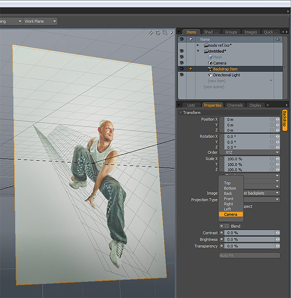
As you can see, the backdrop rotates as we rotate the view. We don’t
want that, we want it to remain still and only move the geometry. In
order to do that go to Projection Type > Camera. This will make the
“backdrop” invisible for the current perspective view, but it will act
as a background for the camera.
Press Command + Space. This will bring up a pop-up menu where you can
choose what your viewport will display. Select Camera of course.
Now if we rotate the viewport the background image will remain still.
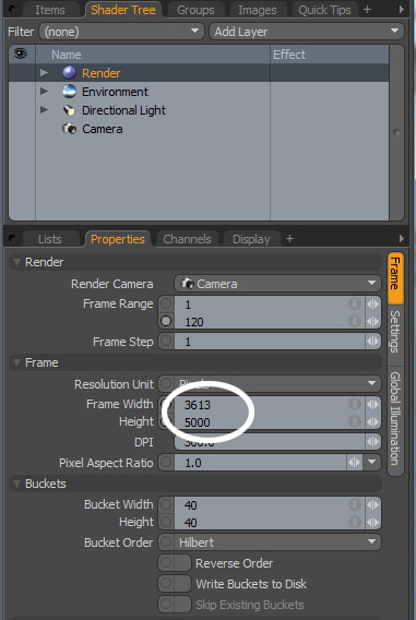
To make sure the rendering will have the same dimensions as our piece,
on the right side go to Shader Tree > Render and set the width/height
of the scene to 3613/5000.
We are ready now to match some geometry.
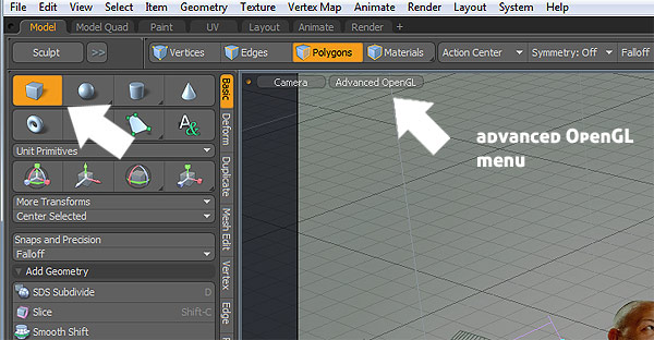
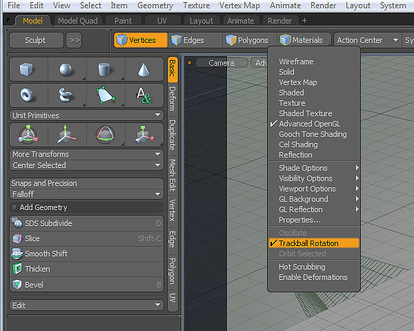
Make sure that Trackball Rotation is active in your camera Advanced
OpenGL menu. This will ensure that the camera will be able to rotate on
all axis not only on XZ.
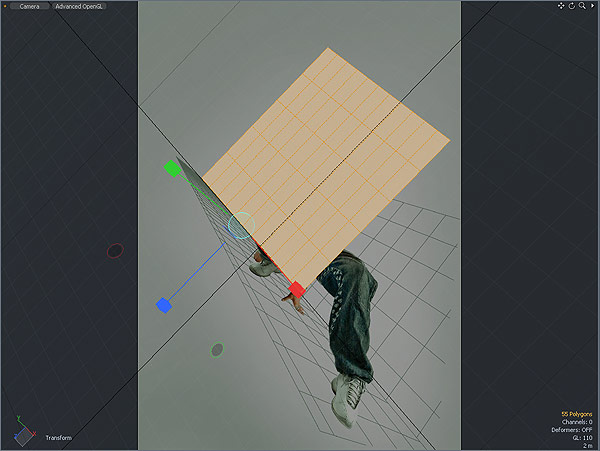
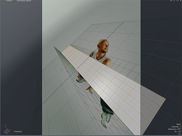
Now the tricky part. By rotating the camera slowly try to match our
3D plane with the one in the reference. Also scale the plane and make it
longer.
One thing is obvious, the camera perspective is not dramatic enough
to match the two planes. When I say dramatic I mean that the parallel
lines do not converge fast enough. So we need to increase it.
The perspective of a camera depends on how wide the entering cone of
light is. The wider the cone, the greater the perspective. The narrower
the cone, the lower. That’s why wide camera lenses tend to distort
images and emphasize perspective. That cone angle is directly controlled
by the focal length. Fortunately Modo’s camera model is very similar to
the real world one, so we can edit that parameter.
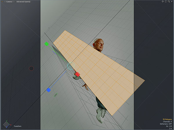
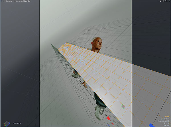
I have found by trial and error that 10mm focal length is close to what we need.
Of course the objects are now smaller, because the wide angle covers
more space. No worries there. We just have to close in with the camera,
and rotate it. Suddenly, the plane fits much better.
Not the perfect match but with a little bit of tweaking the camera we are there.
This can be a tedious process because the first time you create the
plane, you have to rotate the camera and change the focal length at the
same time to get a good match. Which can be tricky and time consuming.
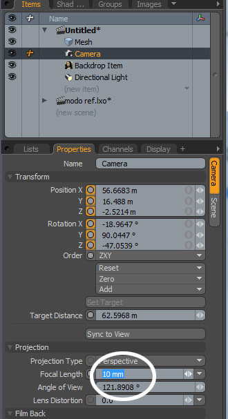
But once you have the focal length determined, everything else is a
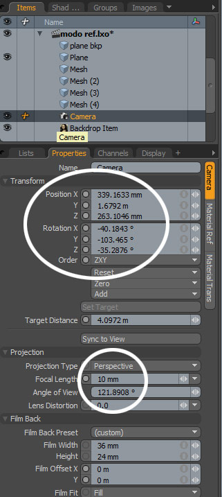
piece of cake. Below are the camera settings to get the exact match.
Once we have that plane into place, we can duplicate, scale and move
it to create different copies. You can move them parallel to each other
to give the feeling of depth.
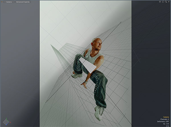
Observe the wide angle of the camera and the final geometry.
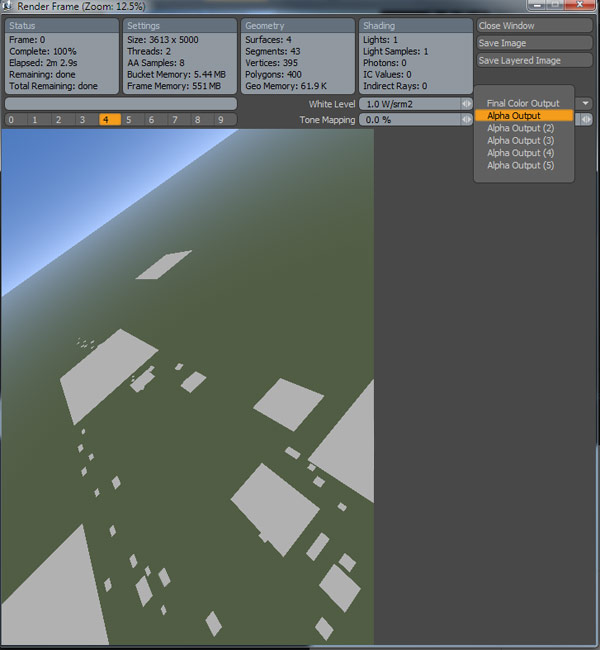
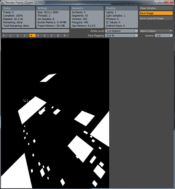
Press F9 to render the Camera view. It shouldn’t take long because it
is a simple scene. This is what you get. Switch to Alpha Output and
save a JPEG.
Back to Photoshop. Let’s see what we got so far.
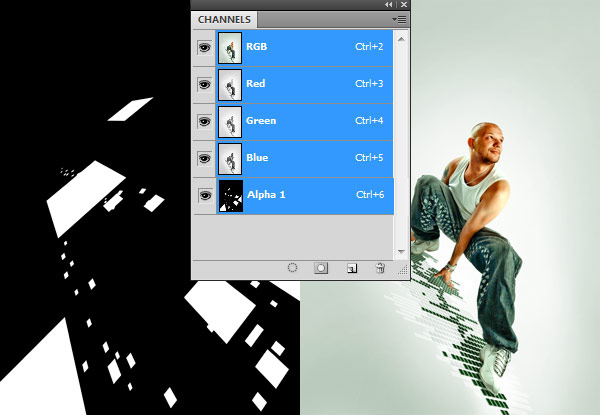
Open the Alpha Image we saved from Modo in Photoshop. Copy it, then
switch to our surfer, in the Channels tab create a new one and paste the
alpha inside.
Now if you Command-click the channel thumbnail you get a selection.
Create a new layer and fill it with orange (#ff8f00).
Cut and paste the images that are supposed to be behind him on a new
layer and move it underneath the “digital surfer” layer in the Layers
Palette. This way they will seem to be behind him in space.
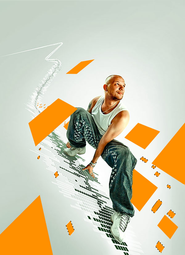
There are too many of them flying right now, they overcrowd the scene
so proceed to erase some of them in order to maintain balance. Most are
from the lower-left corner.
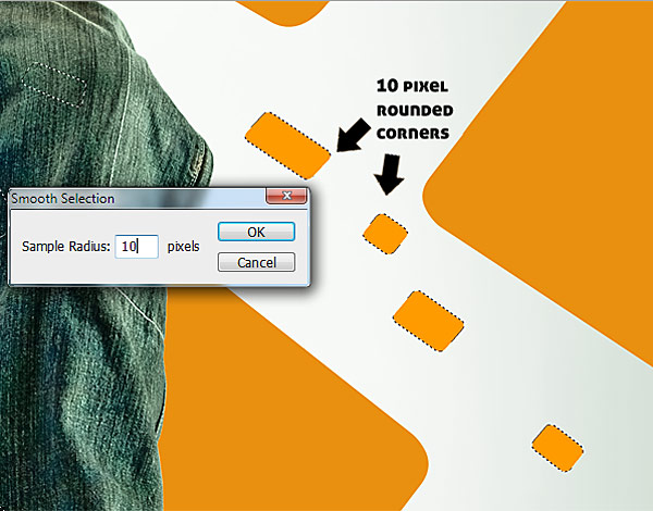
Now we will round off the corners of the images, so they look a
little less pointy. To do that load the layer selection by
Command-clicking on its thumbnail in the Layers Palette. We will first
round off the small rectangles, as they need a smaller radius, and then
progressively do the others. Subtract parts of the selection to obtain
the one below.
Go to Select > Modify > Smooth and set the radius to 10 pixels.
Then press Command + Shift + I to inverse the selection and delete.
There you go. You now have rounded corners.
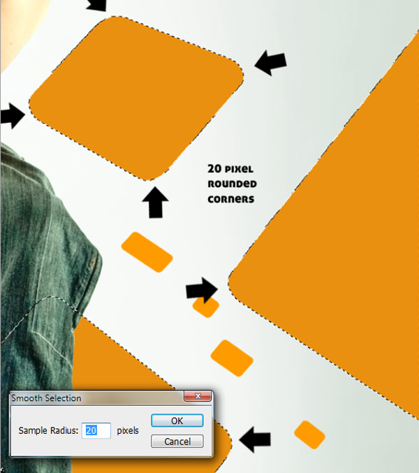
We need to apply the same technique to the larger images. This time
with a radius of 20 pixels since they are closer to the camera. Do this
for the next selection.
You will get this result.
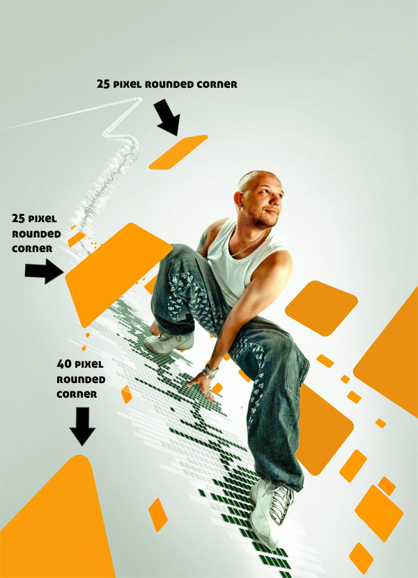
And now the final step of this process is to round the corners of the
foreground images. Repeat the above steps with using the radius in the
image.
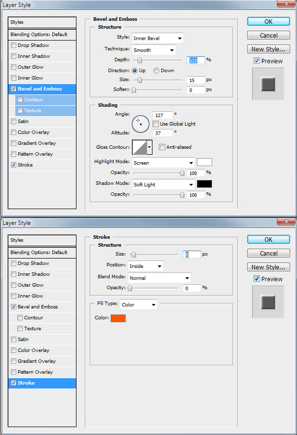
Proceed to apply the following style to the image layers. We need to give it a little depth.
The difference is very subtle around the edges but its still there.
Now we will assign different opacities to various images depending on
how far they are from the camera. I need you to copy and paste the
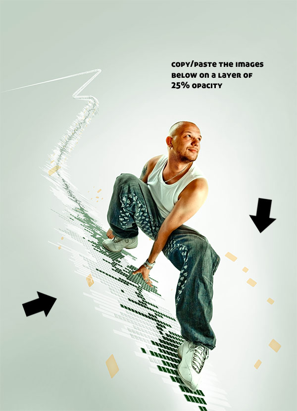
following onto a new layer and assign it 25% Opacity.
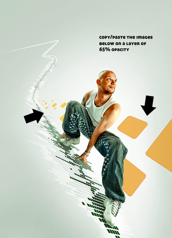
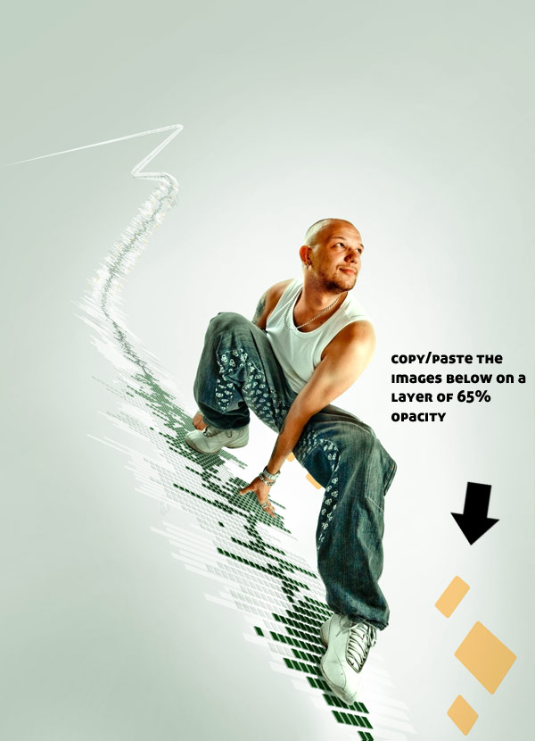
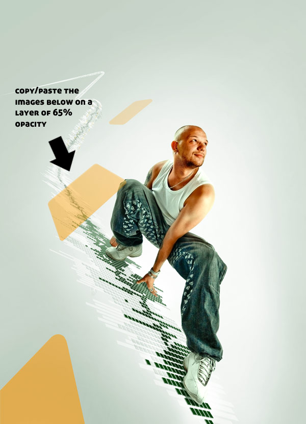
Copy and paste into a new layer the following selection and assign it a 65% Opacity.
Copy and paste the following selection into a new layer and assign it a 44% Opacity.
Copy and paste the following selection into a new layer and assign it a 75% Opacity.
After all these steps you should be looking at something like this.
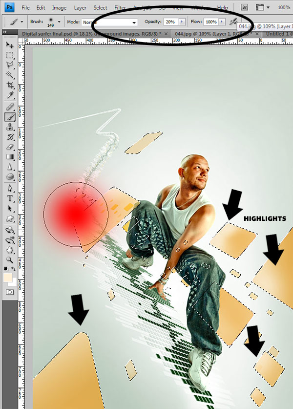
The next thing to add are some highlights over the flying rectangles.
Select all of them, then with a 20% Opacity, soft brush, paint some
highlights on them. Take a look at the second picture below to get an
idea.
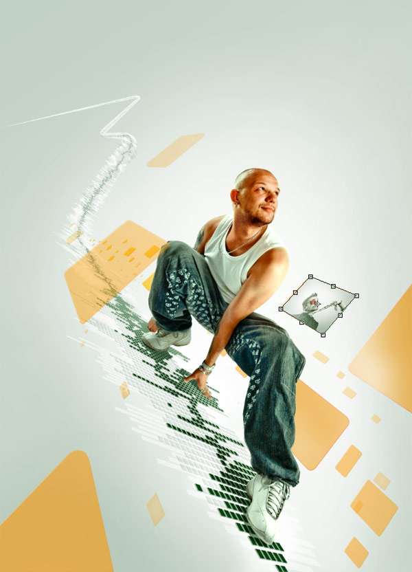
The only thing left to do now is add some textures on top of them. I
will demonstrate the technique used for one of the images, then by
repeating it a lot all the other rectangles can be filled too. We’ll use
one of my photos to do this. You can find the rest of the images used
images here:
xn3ctz.deviantart.com/gallery/. This is my portfolio of stock photography. Feel free to use them.
Anyway, copy and paste this image into a new layer in Photoshop.
Using the Transform tool Command-drag the corners to fit one of the rectangles we want to texture.
Then set the layer to Overlay blending mode and use a mask to round
off the corners. The opacity can depend on the distance to the camera,
meaning that the images in the background can be a little transparent to
give the feeling of depth.
After you do this with all the other images you should end up with
something pretty nice. Anyway, it is time consuming so I’ll jump
straight to the end result.
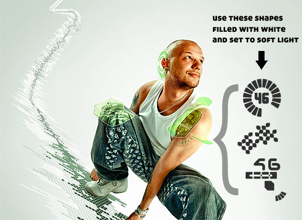
Step 6 – Translucent Interface
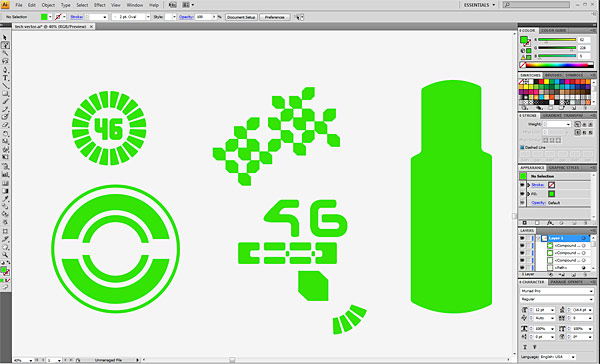
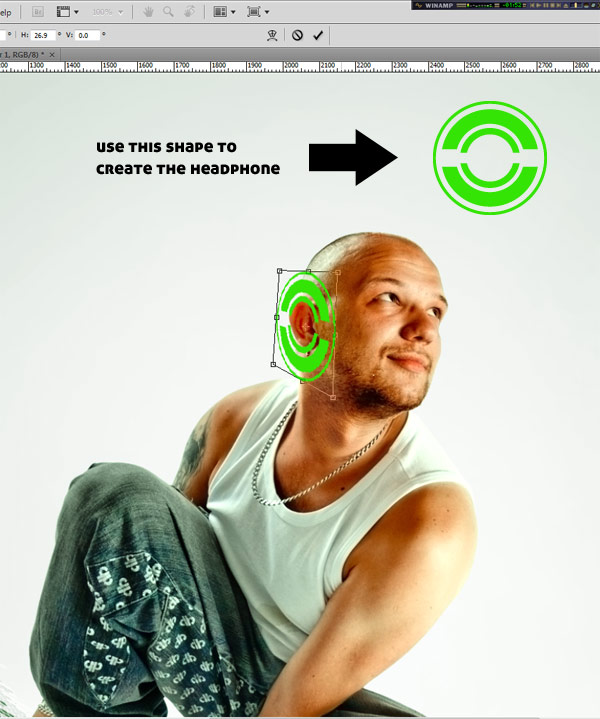
I started by creating these fairly simple shapes in Illustrator. They will act as textures for the interface pieces.
Copy the bottom left shape into Photoshop and place it into position.
Set it to Multiply with 35% Opacity and apply the following layer styles.
Use the same settings and the Illustrator paths we first created to add the next shapes.
Add some texture using the other shapes. They should be white set to
Soft Light blending mode at 100% Opacity. Place them using the
Transform Tool (Command + T) and fit them to the interface pieces.
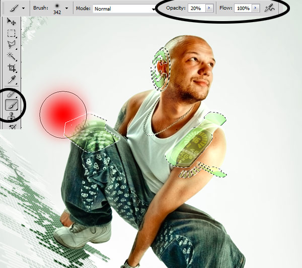
And now
FINALLY the last step. Create a new layer, load the
interface selection, and with a 20% Opacity, soft, white brush paint
some highlights just as we did with the rectangles.
THAT’S IT! Just zoom-out turn on the visibility of all layers and enjoy!
Conclusion
With this tutorial we have explored various ways to create the
feeling of depth and space while maintaining perspective. All starting
from a simple photo, adding layers and layers of details all working
together in a seamless piece.
I hope you liked it and learned some new techniques from this tutorial. See you online. Cheers!
Subscribe to the
Psdtuts+ RSS Feed for the best Photoshop tuts and articles on the web.


0 komentar:
Posting Komentar